Pop-up validation in Xamarin with MvvmCross

Today, you will learn how to implement a pop-up dialog validation for Xamarin cross-platform apps. This post is based on a previous article about custom pop-up implementation, so be sure to check it out first:
We already have a sample authorization screen. To make this sample user-friendly, we need to block the Login button if the login or password is empty, and display the validation messages that describe why users cannot proceed.
When should these validation messages be shown?
The obvious answer is: always when the input field contains invalid data. But from the UX point of view, it would be annoying for users to see validation errors during editing, since the data has not been completed yet.
Instead, we will display the validation errors as soon as the user leaves the text field. Simultaneously, the Login button needs to be disabled when the login form has not passed the validation.
ViewModel Update
Let’s extend the existing LoginViewModel to have a validation logic: it is a simple string.IsNullOrWhiteSpace check.
For the public API, we need several additional public fields to be added:
ValidateUsernameCommandandValidatePasswordCommand— called when the username or password text fields lose focus to display errors, if any.UsernameValidationErrorandPaswordValidationError— contains validation errors for the entered username and password.IsValid— holds the general flag indicating that the whole login form is valid or not.
Now, the LoginCommand depends on the IsValid property.
To automatically call RaiseCanExecuteChanged for this command, you could use SByteDev.MvvmCross.Extensions library and the RelayOn extension method:
_subscription = LoginCommand.RelayOn(this, () => IsValid);Do not forget to dispose this subscription, for instance, in the ViewDestroy method of MvxViewModel.
Here is the updated source code for the LoginViewModel:
Android View Update
On Android, we start by creating a new MvxAlertDialogFragment class to create an AlertDialog and manage dialog buttons.
Our existing LoginDialogFragment will be derived from that base Fragment.
1. Login Layout Update
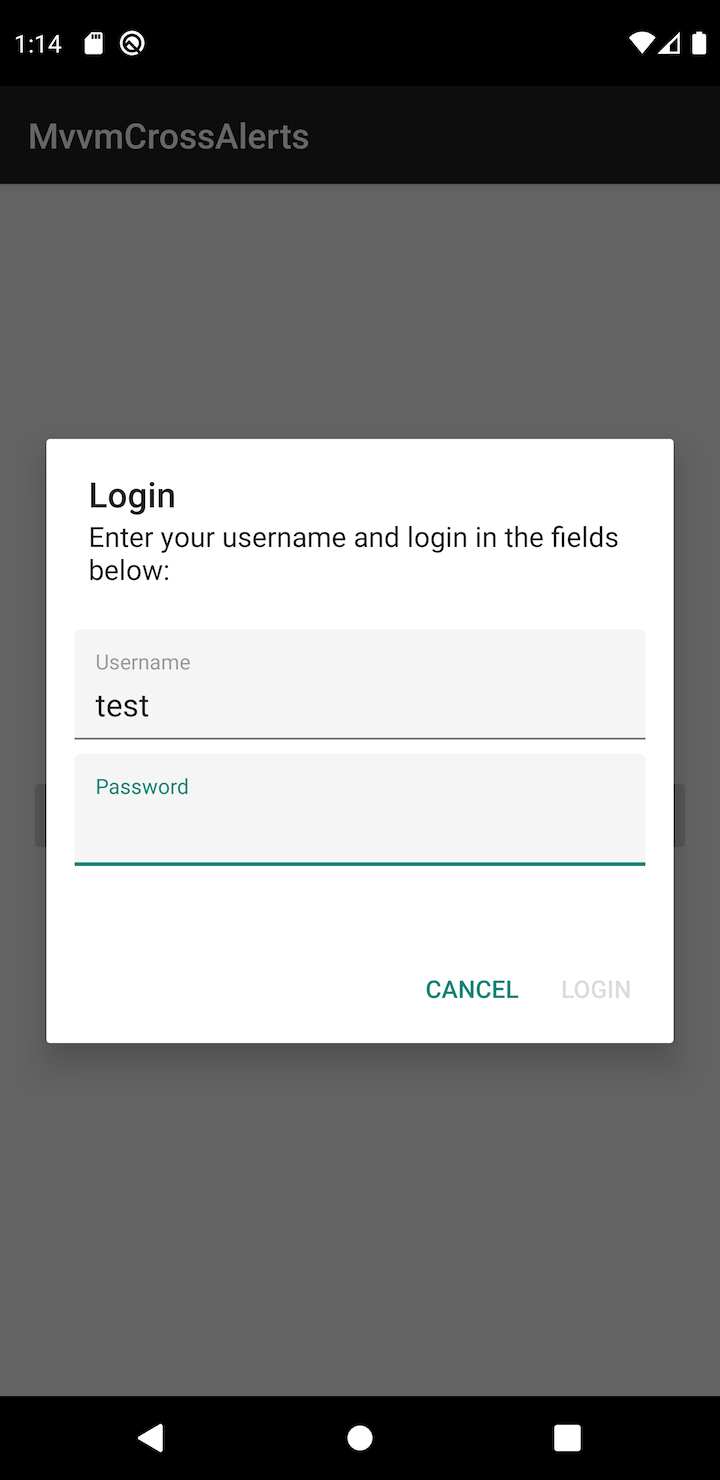
The only update needed for the dialog layout is the error bindings applied to the TextInputLayout:app:MvxBind=”Error UsernameValidationError” and app:MvxBind=”Error PasswordValidationError”.
Those bindings set an error message that will be displayed below the TextInputEditText. If the error is empty, edit text will clear the error message.
The final result will look like this:


2. MvxAlertDialogFragment Implementation
The new base fragment derives from MvxDialogFragment and provides an API for setting the title of the dialog box, message, layout, and buttons.
The first thing we need is an actual AlertDialog object.
In the OnCreateDialog method, we must create an ‘empty’ dialog, and store the local reference to this dialog, to be able to customize it later:
public sealed override Dialog OnCreateDialog(
  Bundle savedInstanceState
)
{
  return _alertDialog = new AlertDialog.Builder(Activity).Create();
}
If you want to bind the dialog title and message from the derived class, you could add these convince properties:
private string _title;
private string _message;

public string Title
{
  get => _title;
  set
  {
    _title = value;
    _alertDialog.SetTitle(_title);
  }
}

public string Message
{
  get => _message;
  set
  {
    _message = value;
    _alertDialog.SetMessage(_message);
  }
}
Let’s move to the dialog content.
That content is a simple view that needs to be created manually or inflated from the layout resource.
To set layout resource identifier, we use a virtual property:
protected virtual int LayoutResourceId => View.NoId;Then, our Fragment will use this identifier to inflate the layout in the OnCreateView method:
public sealed override View OnCreateView(
  LayoutInflater inflater,
  ViewGroup container,
  Bundle savedInstanceState
)
{
  base.OnCreateView(inflater, container, savedInstanceState);

  return LayoutResourceId != View.NoId
    ? this.BindingInflate(LayoutResourceId, null)
    : new LinearLayout(Context)
    {
      LayoutParameters = new ViewGroup.LayoutParams(
        ViewGroup.LayoutParams.MatchParent,
        ViewGroup.LayoutParams.WrapContent
      )
    };
}
There is a default LinearLayout used as a fallback when the child class does not need any additional text fields in the dialog.
And finally, we are going to set the view to the dialog in the OnActivityCreated method:
public override void OnActivityCreated(Bundle savedInstanceState)
{
  base.OnActivityCreated(savedInstanceState);
  _alertDialog.SetView(View);
}
Dialog buttons require a little bit more work because they are interactive elements and should reflect the state of the connected ICommand:
- When
ICommand.CanExecutereturns false, the button should be disabled - When the button is clicked, the
ICommand.Executemethod should be called
This logic is implemented in the UpdateButton method:
private void UpdateButton(DialogButtonType type, ICommand command)
{
  var button = _alertDialog.GetButton((int) type);
  if (button == null) { return; }
  button.Enabled = command.SafeCanExecute();
}
The main entry point for these dialog buttons is a protected SetButton method:
protected void SetButton(
  DialogButtonType type,
  string title,
  ICommand command
)
{
  _commands[type] = command;
  _alertDialog.SetButton((int) type, title, OnButtonClicked);
  _disposables.Add(command.WeakSubscribe(OnCanExecuteChanged));
}
In this method we:
- Store the command associated with the particular button type.
- Set the button to
AlertDialog. - Subscribe for the
CanExecuteChangedevent of the command to update the button state dynamically.
We can implement the OnCanExecuteChanged method this way:
private void OnCanExecuteChanged(object sender, EventArgs args)
{
  if (!(sender is ICommand command)) { return; }
  var type = _commands.First(item => item.Value == command).Key;
  UpdateButton(type, command);
}
3. LoginDialogFragment Update
The ViewModel already supports the validation, and error messages are bound in the layout file. The last thing left is to ensure that the ValidateUsernameCommand and ValidatePasswordCommand are executed when edit texts lose focus. We can use EditText.FocusChange event to achieve that:
private void OnUsernameEditTextOnFocusChange(
  object _,
  View.FocusChangeEventArgs args
)
{
  if (args.HasFocus) { return; }
  ViewModel.ValidateUsernameCommand.SafeExecute();
}
💡 You may notice that we used
SafeExecuteandSafeCanExecuteICommandextensions.These extension methods perform a null check and check if the caller can execute the command before calling the
ICommand.Executemethod.To learn more, refer to the SByteDev.Common.Extensions NuGet package.
iOS View Update
As usual, iOS implementation is a tricky part.
The main problem is that, unlike Android, iOS text fields do not support validation messages.
We cannot use custom text fields because we have no control over creating these text fields: an UIAlertController creates them.
To make the implementation easier, we are going to use a single UILabel to display errors for both login and password text fields.
1. MvxAlertViewController Update
New features required for MvxAlertViewController to support validation are dynamically enabling or disabling buttons and a displaying validation message.
As in the case of Android, to update buttons, we will use the ICommand interface’s capabilities.
To listen for the CanExecuteChanged event, we need to add the following lines to the AddAction method, right before the return statement:
_commands[alertAction] = command;
alertAction.Enabled = command.SafeCanExecute();
_disposables.Add(command.WeakSubscribe(OnCanExecuteChanged));
The OnExecuteChanged method will look like this:
private void OnCanExecuteChanged(object sender, EventArgs args)
{
  if (!(sender is ICommand command)) { return; }
  var pair = _commands.First(item => item.Value == command);
  var alertAction = pair.Key;
  if (alertAction == null) { return; }
  alertAction.Enabled = command.SafeCanExecute();
}
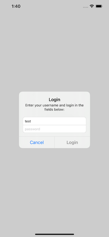
The UITextField does not support error displaying, and since we use the default iOS alerts, the error could be displayed in the content of the UIViewController itself.
UIViewController will display the content between the description and the text fields of the alert:

This content can be of any size, but we will use View’s size for this example.
To make it possible, we need to create the View height constraint:
public override void ViewDidLoad()
{
  base.ViewDidLoad();
  _heightConstraint = View.HeightAnchor.ConstraintEqualTo(0);
  View.AddConstraint(_heightConstraint);
}
And update its Constant when the derived class updates the content:
protected void LayoutIfNeeded()
{
  if (View.Frame.Width == 0) { return; }
  _heightConstraint.Constant = View.SizeThatFits(
    new CGSize(View.Frame.Width, 0)
  ).Height;
}
The derived view controller will have to call this LayoutIfNeeded method when the content height needs to be recalculated.
2. LoginViewController Update
Again, we need to call validation commands when the text fields are out-of-focus and bind errors to the text label.
Thanks to the MvvmCross binding extensions, today we have commands binding:
set.Bind(usernameTextField)
   .For(v => v.BindEditingDidEnd())
   .To(vm => vm.ValidateUsernameCommand);
set.Bind(passwordTextField)
   .For(v => v.BindEditingDidEnd())
   .To(vm => vm.ValidatePasswordCommand);
For the error message binding, we need a UILabel that will be used as a View of the LoginViewController:
public override void LoadView()
{
  View = _validationErrorLabel = new UILabel
  {
    Font = UIFont.PreferredFootnote,
    TextColor = UIColor.Red,
    Lines = 0,
    LineBreakMode = UILineBreakMode.WordWrap,
    TextAlignment = UITextAlignment.Center
  };
}
💡
Lines = 0andLineBreakMode = UILineBreakMode.WordWraptrick is necessary to display the errors on multiple lines.
So if the LayoutIfNeeded method is needed to call whenever the error message changes, we are going to create an additional property to set the error message and update the label height:
public string ValidationError
{
  get => _validationErrorLabel.Text;
  set
  {
    _validationErrorLabel.Text = value;
    LayoutIfNeeded();
  }
}
You may have noticed that we have two error properties for login and password, but a single label for displaying them.
Yes, we will bind two properties from the ViewModel to a single text property in the View. To do this, we need to create a value combiner.
Let’s call it StringValueCombiner:
Then, we bind it like this:
set.Bind(this)
   .For(v => v.ValidationError)
   .ByCombining(
     new StringValueCombiner(),
     vm => vm.UsernameValidationError,
     vm => vm.PasswordValidationError
   );
And the final result will look like this:


This post completes the cross-platform pop-up implementation with simple validation support.
When you need complex validation rules in real-life, you might find the FluentValidation library is very helpful.
As usual, you can download a complete source code on GitHub:
